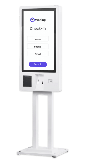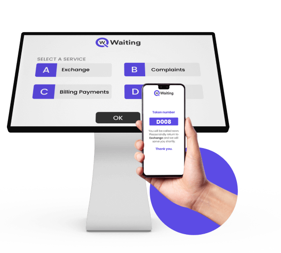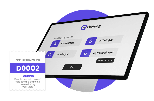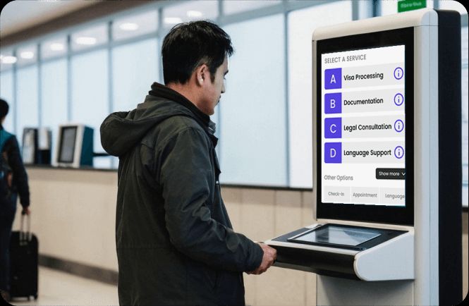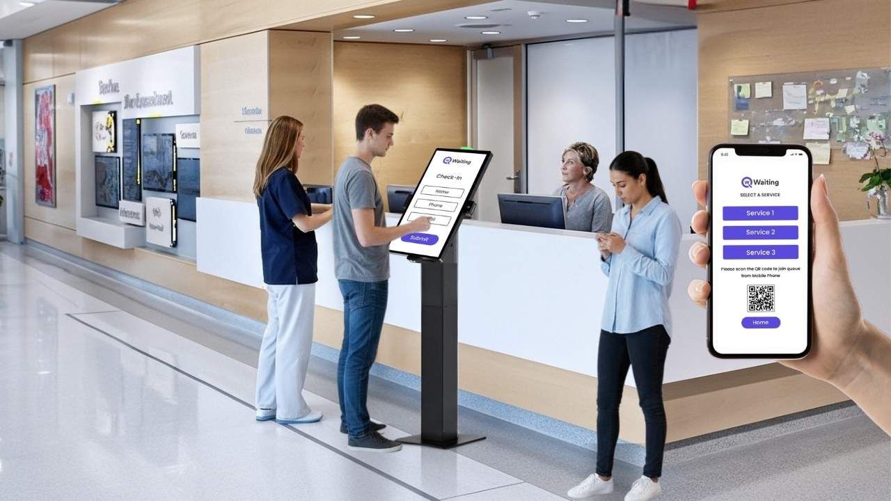
Walk into any business today, whether a bank or a retail store, and you will probably see an interactive touchscreen machine that people use to initiate payments or to raise a query. That’s a kiosk machine. That touchpoint, those few seconds on a screen, shapes everything that follows. Yet most businesses still treat kiosks like simple machines that just give out tickets. But interactive kiosks are much more than that. They offer a significant opportunity to connect with customers. Kiosks can change what people do, and can help the business earn more money.
Here’s the reality. A well-designed kiosk doesn’t just reduce staffing costs or speed up check-ins. It becomes a conversion engine. When you combine smart kiosk branding with contextual on-device offers and intuitive UX design, you’re not just serving customers, you’re guiding decisions, increasing basket sizes, and creating experiences people actually remember. The difference between a kiosk that frustrates and one that converts often comes down to a handful of design choices that most operators overlook.
This isn’t about making screens prettier. It’s about engineering interfaces that respect attention, reduce friction, and quietly drive action, without feeling pushy or overwhelming.
Why Kiosk Branding Matters More Than Ever
Kiosks are now strategic assets. As customer expectations shift toward speed and autonomy, the brands winning market share are the ones treating self-service kiosk branding as seriously as they treat their apps or websites.
Here’s how it’s changing the modern business environment:
The Evolution of Kiosks: From Service Touchpoints to Profit Drivers
Ten years ago, kiosks were only used for easy tasks. They let you:
- Check in.
- Print a ticket.
Now, kiosks help businesses make much more money. Retail stores use them to encourage customers to buy extra things. Hospitals use them to check insurance and provide faster services. Banks guide customers and promote better accounts.
This big change happened for a simple reason. Companies realized that if someone is already looking at the screen, they should guide them. They should show them a better choice or outcome. Businesses now treat kiosk screens like the best display in a store. It is like prime space. The best part is that a kiosk is very smart. It knows:
- Who you are.
- Why are you there?
- What you probably need next.
Here’s how modern kiosk screens simply stand out from traditional kiosks:
| Traditional Kiosks | Modern Revenue-Driven Kiosks |
| Static check-in only | Dynamic, context-aware interactions |
| Generic interface for all users | Personalized journeys based on data |
| No upsell or cross-sell logic | Intelligent offer triggers tied to behavior |
| Isolated from other systems | Integrated with queues, CRM, and analytics |
| Brand-neutral design | Fully branded, trust-building experience |
What Today’s Customers Expect From On-Device Interactions
Getting things done quickly is important, but being clear is even more important. People expect kiosks to be faster than talking to a person. They also expect the machines to know why they are there.
For example, if you have an appointment, the kiosk should not ask for details it already knows. If you visit often, the kiosk should recognize you. If the waiting time is long, the machine should give you choices, such as:
- Paying for a faster service.
- Choosing a different time.
- Buying something extra to make the wait seem worth it.
How the screen looks quickly affects how people think of the business. A clean, smooth screen shows the company is good at what they do, but an old or confusing screen suggests the company doesn’t care. This is true even if the company’s work behind the scenes is excellent.
The Psychology Behind On-Screen Decisions
When users know what will happen next, they use the screen with confidence. If the steps are confusing, people hesitate. For example, if buttons are too small or the interface is too difficult to use, people may hesitate to use it. That hesitation makes them less likely to finish their task.
Small actions can lead to bigger actions. Asking someone to “confirm your visit type” is a small tap. This prepares them to take the next, bigger step, like accepting an offer. This is how good shopping screens work. Momentum builds trust. How the screen makes you feel is important. It’s better to keep in mind:
- Using calm colors like blues and greens to reduce stress.
- Too many words or tight spacing make it harder to think.
- Words like “You’re almost done” work better than instructions to “Complete the following steps.”
These small design choices are very important. They can be the reason why many more people finish their tasks on the screen.
If you want a deeper look at how self-service kiosks directly impact revenue, efficiency, and customer experience, explore our guide on
how businesses can enhance customer satisfaction with an interactive self-service kiosk machine
Designing Kiosk UX That Actually Influences Decisions
Good kiosk design is so smooth that you barely notice it. It just works correctly and guides users through the steps easily, so they don’t struggle, eliminating the guesswork.
Here are a few tips to help you design your kiosk for better conversions:
Layouts That Guide Attention and Reduce Cognitive Load
How the screen is designed helps guide people naturally. Our eyes usually move from the top to the bottom, and from the left to the right.
You should put the most important thing the user needs to do right in the center of the screen. Use these tricks to make a clear path:
- Size: Make important buttons bigger.
- Contrast: Make them stand out with different colors.
- Whitespace: Use spaces around things so they look clear.
“If people have to search around for the ‘Next’ button, the design is bad.”
Using smart contrast helps people see the difference between the main things they need to do and the smaller, less important choices. A good design makes the navigation easy.
Before: A cluttered screen with six equal-sized buttons, competing offers in pop-ups, and unclear next steps.
After: One clear primary action, two optional secondary paths, and a single contextual offer presented after the main task is complete.
Personalized Journeys That Respond to Real-Time Context
Special limited deals are much better than offers that are always the same. These services change based on things like:
- What service do you need?
- When did you last visit?
- The time of day.
Offers that are right for the situation feel helpful to the customer. And those, not related, feel annoying. The secret is the timing and the situation.
When kiosks use information about waiting lines or appointment history, they stop guessing. Instead, they know exactly how to guide the customer.
Here’s what a retail chain owner has to say after customizing their kiosks’ UX for more conversions:
“After integrating real-time personalization into our kiosk flows, we saw a clear communication, and our staff members could focus on other important tasks. We saw a 34% lift in service upgrade acceptance, without changing our pricing or adding more offers. The system just learned when to ask.”
— Operations Director, Fair Price
UX Mistakes That Kill Engagement (and How to Avoid Them)
Screens that are too full of information confuse people. If a user has to read a whole paragraph just to see their options, the screen is poorly designed. You should limit the choices offered. Being clear is much more important than showing every single option.
Hidden CTAs or conflicting choices paralyze decision-making. If “Confirm” and “Go Back” buttons look identical, users freeze. Make the primary action obvious. Make the secondary one deliberately less prominent.
Too many ads or pop-ups that don’t matter destroy trust. If you are trying to check in, and three different ads interrupt you, you will likely walk away.
The timing of offers matters. One offer that makes sense for the situation works well. Three random offers will ruin the experience.
Slow screens or screens that change with too much visual noise break the flow. Every time something moves or a new screen loads, it should feel like it was meant to happen, not just like a pause. Speed helps keep the momentum going. Delays will quickly make people angry.
On-Device Offers That Drive Real Business Results
Smart kiosk engagement strategies don’t push products. Instead, they show customers options when they are ready to think about them. This is the key difference. It is what separates offers that make the business money from annoying pop-ups.
Offer Types That Perform Best Across Industries
Retail: In retail stores, impulse add-ons, product upgrades, and loyalty sign-ups work when tied to checkout or pickup flows.
These work best when you are already paying or picking up an order. If a customer has already decided to buy something, they will listen. They respond well to questions like:
- “Do you want to add batteries for $3?”
- “Join our rewards program now for 10% off today.”
Healthcare: In places like hospitals and clinics, kiosks help a lot. They make sure patients are checked in correctly, sign up for emergency check-ins, or send a confirmation of appointment to the patients. This saves the staff a lot of time and makes patients happier.
Kiosks at hospitals or clinics are not just trying to sell you something extra; they are solving a real problem by letting patients consult the doctor sooner when they really need to.
Banking and Government: Kiosks help businesses run much more smoothly. They can guide people where to go next, send appointment reminders. and even ask you to upload papers or forms right away.
For example, a kiosk might say: “Upload your documents now to save 15 minutes at the counter.” This is not pushy. It is simply practical and helps everyone save time.
Here’s how an interactive kiosk affects revenue opportunities in different industries;
| Industry | Offer Type | Expected Engagement Lift |
| Retail | Impulse add-ons at checkout | 22–35% acceptance |
| Healthcare | Priority service upgrades during peak hours | 18–28% opt-in |
| Banking | Digital account feature promotions | 12–20% conversion |
| Government Services | Appointment pre-booking nudges | 30–40% adoption |
66% of consumers prefer self-service over dealing with staff. So if your business still does not have a kiosk installed yet, you are already lagging behind. See how top industries are utilizing the technology for better customer flow in our blog:
Using Data to Trigger the Right Offer at the Right Time
Kiosks can get smart information about people visiting the business. They learn about:
- How many people are walking in?
- The busiest times.
- What kind of visit are people making?
This information makes the offers much smarter. A kiosk connected to a queue management system knows when the waiting time is long. Then, it can offer a faster service automatically.
It also knows if you have visited before. If so, it can skip questions you already answered. What this really means is that the system stops guessing. Instead, it reacts to what is happening right now.
Avoiding Offer Fatigue Without Killing Conversions
It is important to show offers at the right speed. You should only show one offer during a session. Wait to show any extra offers until the user finishes their main task. If the person has already said yes to an offer before, skip it entirely. Also, skip offers if the person is taking too long on the screen.
Use simple language that makes offers feel easy. Try using phrases like:
- “Want to save time?” (This is gentle language.)
- “You can skip this.” (This makes it feel optional.)
The main goal is to make the offers seem like helpful ideas, not like barriers that get in the way of what they want to do.
Metrics That Matter to Decision-Makers
When more customers accept the extra offers on the kiosk, the business makes more money. Even if the wait time is the same, customers feel happier because the screen keeps them busy. More people finishing their tasks means less wasted effort for the company.
Faster, smoother interactions mean the business serves more people per hour. This makes the staff and space used more worthwhile. Higher opt-in conversions for loyalty programs, digital services, or appointments drive long-term value beyond the immediate transaction.
Lower drop-off mid-journey means fewer walk-aways. Every percentage point improvement in completion rate translates to more served customers and less wasted infrastructure. Kiosk performance links directly to total customer throughput. Faster, smoother interactions mean more people processed per hour, which means better ROI on physical space and staffing.
How Qwaiting Turns Every Kiosk Into a Revenue-Driving Experience Platform
Most kiosk systems just take care of money changes or simple tasks. But Qwaiting focuses on the full experience you have. The difference is not about the technology. It is about how the company plans things.
Qwaiting connects the screens to important information, and uses data about waiting lines, past appointments, and what is happening right now. This turns the self-service kiosk into a smart tool that really connects with the customer.
A Unified Engagement Engine for Kiosks, Queues, and Appointments
Information about waiting lines, service needs, and customer loyalty helps make smart offers on the screen.
When a kiosk knows how long you have waited, how often you visit, and what service you need, it gives you the right message. It does not just use the same message for everyone. A person visiting for the first time gets a welcome message. A customer who visits often gets faster options and special suggestions.
It is important that the kiosk experience matches what happens everywhere else. If someone books online or uses a mobile app, the kiosk should know. This makes the whole process smooth. This smoothness builds trust with the customer at every step.
Scalable Customization for Multi-Location Enterprises
It is easy to manage many kiosks at once from one central place. The company’s IT teams can send out new updates and change the offers without going to each computer. They can also change how the screens look to match the brand.
Different teams, like marketing or operations, have their own dashboards. These show them only the information they need. This way, they are not confused by data that does not matter to their job.
Changes happen right away across all locations. If someone changes an offer, updates the small words on the screen, or changes the line rules, it happens everywhere instantly. They only have to do it once.
Real Results From Real Businesses
Fair Price is a leading and most trusted retail store in Singapore, with over 350 outlets. One location started using the smart kiosk system by Qwaiting.
After just six months, they saw a big improvement. More people specifically signed up for their loyalty program. The average amount people spent also went up by 37% because of offers shown on the kiosks.
The main reason for this success was not showing more offers. The key was showing the offers at the right time and in a way that felt more natural.
Conclusion
Kiosk branding isn’t about making screens look nice, it’s about engineering experiences that guide decisions, build trust, and drive measurable results. The businesses winning in self-service aren’t the ones with the most kiosks. They’re the ones treating every screen as a strategic asset, every interaction as a conversion opportunity, and every design choice as a reflection of their brand.
When you combine thoughtful kiosk UX design with contextual on-device offers and smart personalization, you’re not just reducing wait times or cutting labor costs. You’re creating engagement loops that generate revenue, improve satisfaction, and scale across locations without adding complexity.
If you’re ready to turn your kiosks into revenue-driving platforms, not just transaction terminals, it’s time to rethink your approach. Book your 14 day free trial with Qwaiting, and optimize branded kiosk experiences that actually convert.

